


client: Irish Museum of Modern Art
date : 2010
printing : MM artbook printing & repro, the Netherlands
binding: uncredited
run: 1,000 copies
size: 240mm x 340mm portrait
extent: 320pg. + endpapers + covers
ISBN: 978-0-907020-08-7
_______________________
covers:
printed 1/1 onto 325grs one side white board
matt laminate and then gloss UV
inside:
320 pages printed 4/4 CMYK onto 135grs *Arctic the Volume
binding:
thread sewn in 16pg. sections
OTA bind
* this paper range has since been completely revised
Awarded silver Bell in the 2011 Irish creative advertising and design (ICAD) awards, and featured in their annual publication.
_________________________
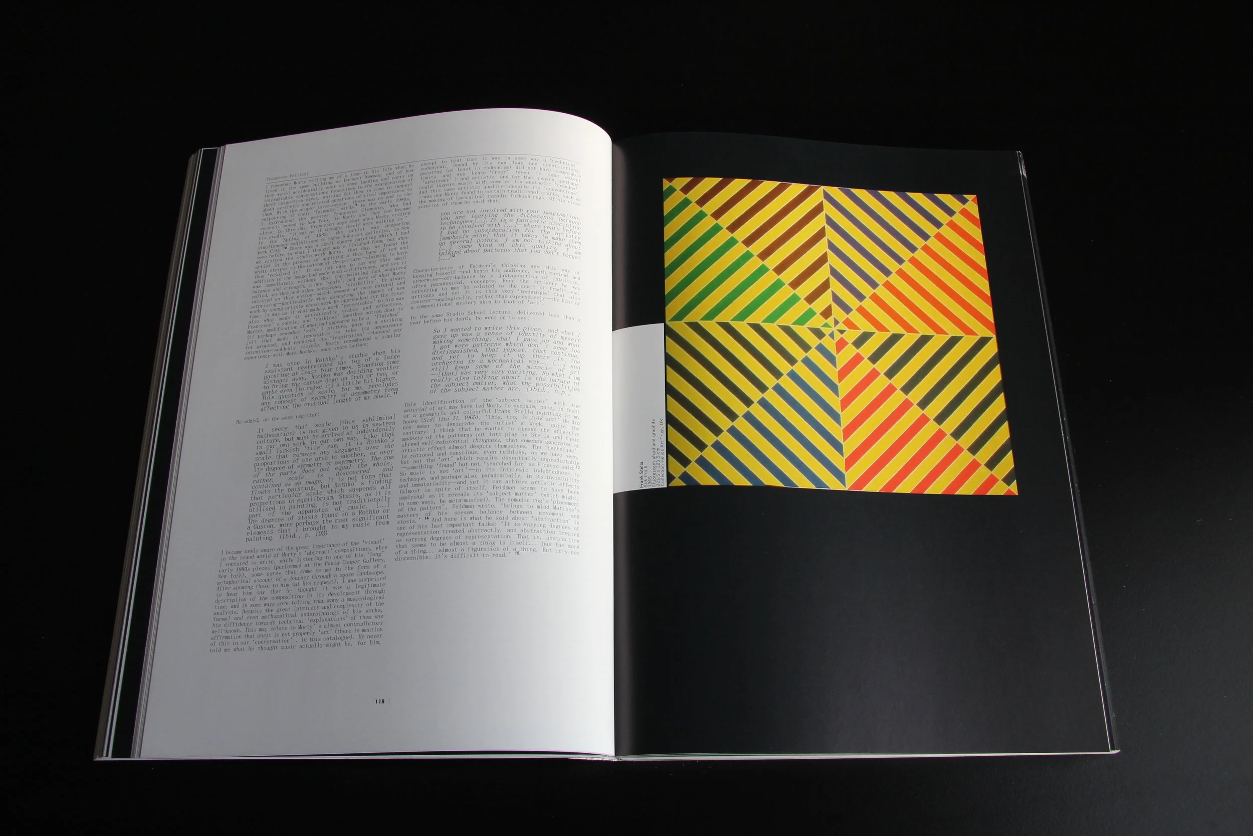
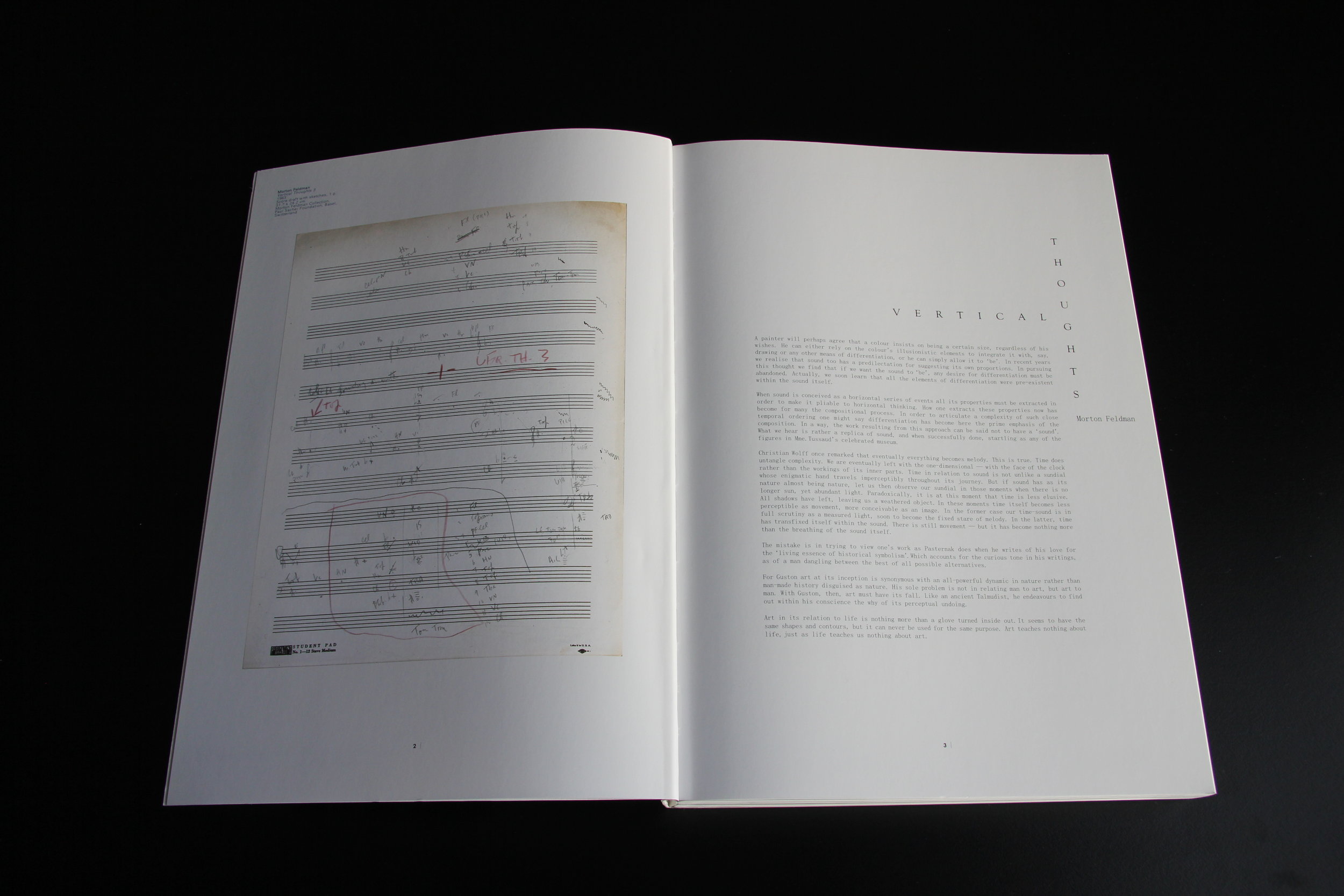
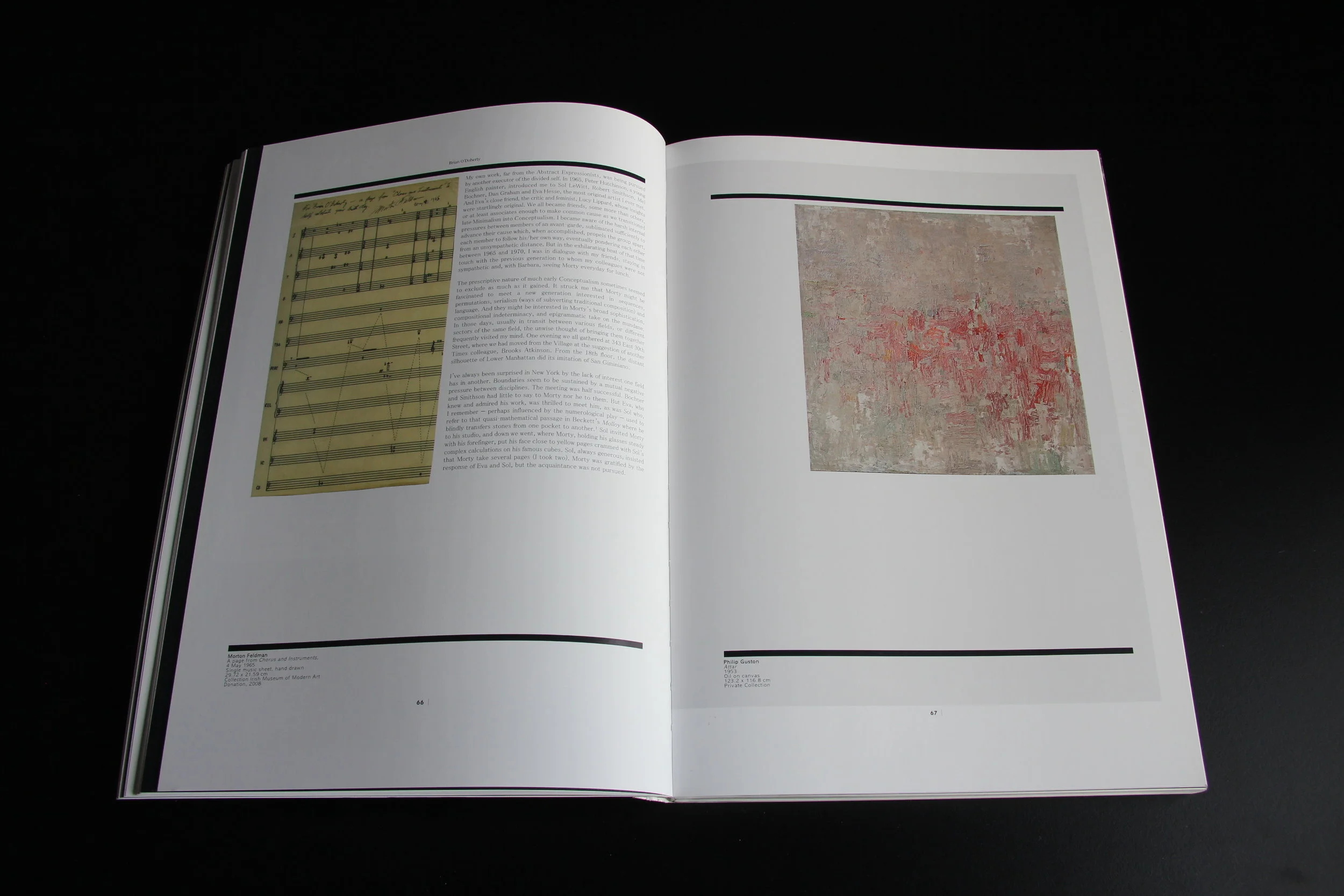
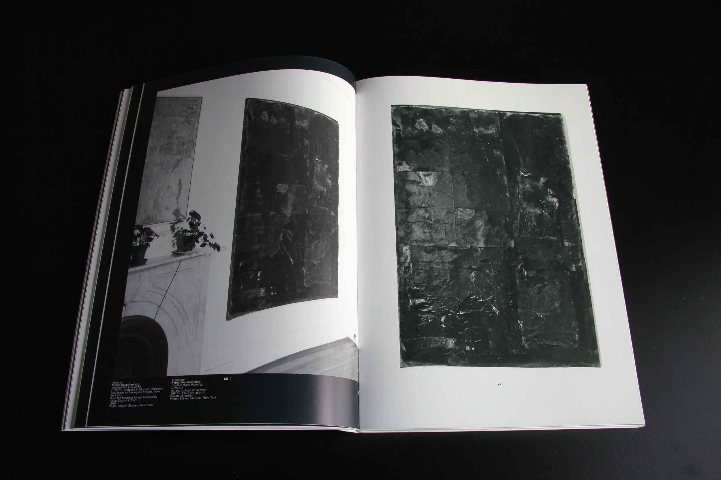
Morton Feldman is widely considered one of the most influential composers of the 20th century. Revolving around a project he curated in 1967 entitled Six Painters, this catalogue considers the impact that modern abstract art had on Feldman's own musical compositions, tracing direct links and hidden meanings. Featuring works from the original six painters - Philip Guston, Franz Kline, Piet Mondrian, Willem de Kooning, Jackson Pollock and Mark Rothko - this publication also includes works by many other artists whom Feldman admired.
The book includes a facsimile reproduction of the entire Six Painters catalogue.
Essayists and contributors: Dore Ashton, Juan Manuel Bonet, Enrique Juncosa, Bunita Marcus, Barbara Monk Feldman, Brian O'Doherty, Francesco Pellizzi, Kevin Volans, Francesco Pellizzi, Sebastian Claren.
Edited by Sean Kissane.
Vertical thoughts was included in the Pallas Periodical Review at Pallas Projects, Dublin, December 2011.
I wrote some notes for the exhibition:
The Six painters reproduction idea came from Juan Manuel and Sean, although I was keen on it including endpapers etc. to be a facsimile reproduction. The quality of the scanning and reproduction here is pretty amazing. The original copy was unbound for scanning in single pages. Floating it in the black surround (it's reproduced s/s) was to make a complete interruption in the book, like an insertion, and to contribute to the lovely black stripes and their irregular rhythm on the cut edges of the book. (The cut edge also works as a fast-find index for some sections of the book!)
In fact black or grey borders were used for all the insertions in the book- eg. for all reprinted texts, so for example the Barbara Monk Feldman article, although reset and not in facsimile, approximates the page size of the original publication it appears in, and is set on a grey background.
Some elements were further 'folded-in' such as the same size reproduction of the "Arts consultants services" letterhead p. 63, or the typewriter typed text by Dory Ashton.
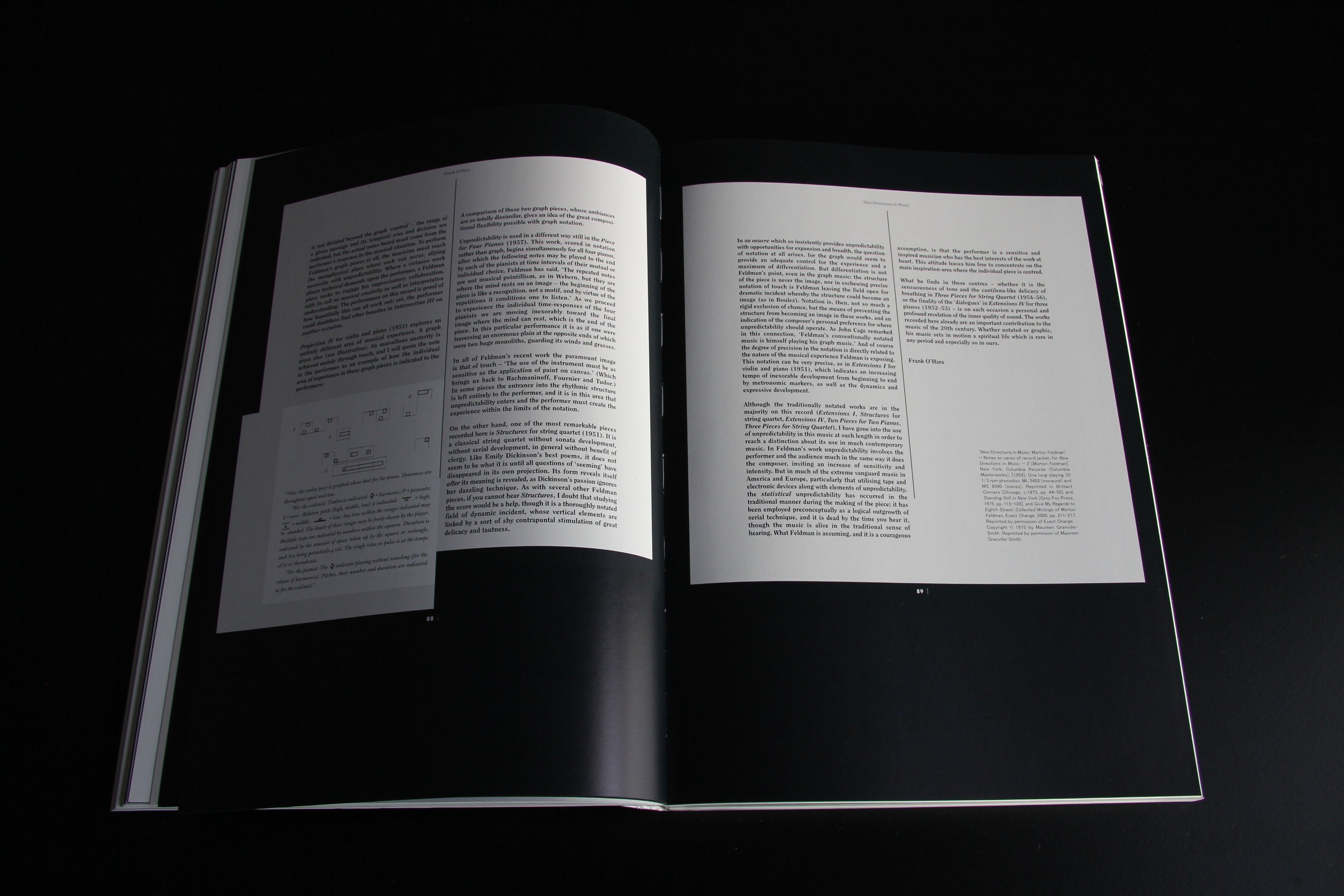
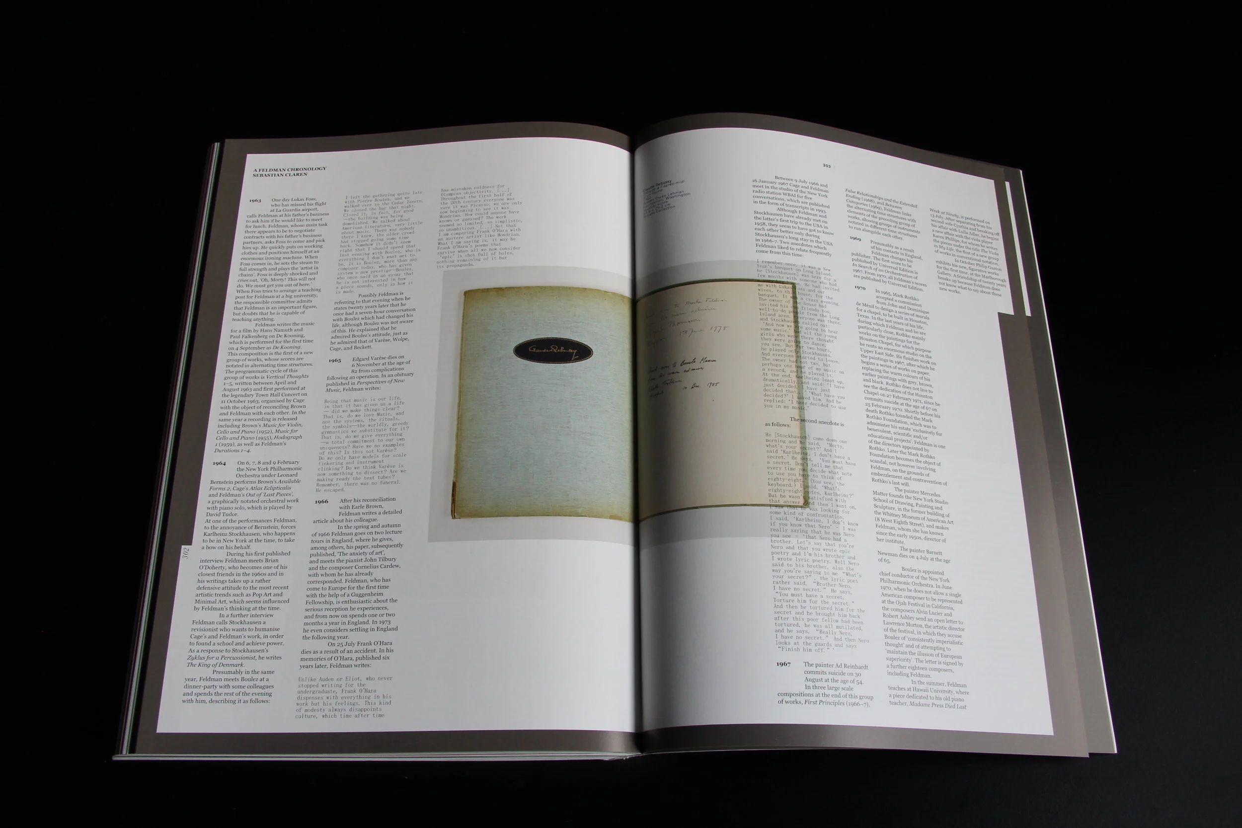
This was intended as a unifying device given the wide variety of sources and material to be reproduced, which included documents, scores, sketches, photographs of varying eras and quality, record covers, images of rugs, and of course paintings and sculptures. there are many authors and voices.
Strangely, the way I found to pull all this together was to have almost no consistency in the layout from one element to the next. Each text is set in a different combination of typefaces, none of which follow a consistent layout or grid, and each evoking different aspects of book/editorial design. The typography is willfully awkward, although far from unreadable. each editorial component was given its own identity in some small way.
The book format was simply the largest possible page size as we were reducing large paintings, as well as manuscripts which would be best enjoyed when reproduced close to their original size.
The paper is the same throughout, in part as a unifying device and also to have a slight suggestion of a directory or catalogue - and with a soft cover - so as not too precious. The binding is an OTA bind where the cover board of the spine is not attached to the book block. This ensures that the book opens quite flat, and the spine does to crease.
Each copy of this book weighs 1.8kg!